Title: New title screen picture
Post by: NaOH on March 17, 2014, 09:29:33 PM
Post by: NaOH on March 17, 2014, 09:29:33 PM
Hi, everybody. I'm new to the Lix community, although I've been playing Lemmings since I was about 3 years old. I sadly lost my floppy disk a few years ago, but I was thrilled when I discovered there was a fan-made (!) open source (!) multi-player (!!) version of the game out there -- Lix.
After having had a blast beating up other people's lemmings with green baseball bats for hours, I think it's safe to say this game is fairly professionally done. I haven't encountered any problems with the network, which is exceptional because it's really hard to write good network code for video-games. I've tried. (Kudos, Simon.)
I was wondering if, as a community, we might be able to improve the opening title screen? Now, I mean no offence to Mikex62, who I believe made the previous one. I actually quite like that design; I think it's adorable that it uses the new graphics theme and shows off all the skills. The thing is, it's kind of cluttered and it lacks some shading, and it's a little abstract. For first-time players, the screen is somewhat off-putting, actually, which is a shame because the game is so awesome. I'm actually guessing probably anybody who hasn't seen the radical Lix gameplay video is thrown off by the rather humble opening screen.
So, I was playing around in the gimp and I drew this picture (attached).

I'm not claiming to be a brilliant artist, so if anybody would like to contribute their own design or edit mine, that would be superb. I'm also drawing another one, which I'll post in a few minutes. What do you think?
If you have any suggestions, I might be able to draw it.
(Edit: having trouble with attachments. Please stay tuned!)
After having had a blast beating up other people's lemmings with green baseball bats for hours, I think it's safe to say this game is fairly professionally done. I haven't encountered any problems with the network, which is exceptional because it's really hard to write good network code for video-games. I've tried. (Kudos, Simon.)
I was wondering if, as a community, we might be able to improve the opening title screen? Now, I mean no offence to Mikex62, who I believe made the previous one. I actually quite like that design; I think it's adorable that it uses the new graphics theme and shows off all the skills. The thing is, it's kind of cluttered and it lacks some shading, and it's a little abstract. For first-time players, the screen is somewhat off-putting, actually, which is a shame because the game is so awesome. I'm actually guessing probably anybody who hasn't seen the radical Lix gameplay video is thrown off by the rather humble opening screen.
So, I was playing around in the gimp and I drew this picture (attached).
I'm not claiming to be a brilliant artist, so if anybody would like to contribute their own design or edit mine, that would be superb. I'm also drawing another one, which I'll post in a few minutes. What do you think?
If you have any suggestions, I might be able to draw it.
(Edit: having trouble with attachments. Please stay tuned!)
Title: Re: New title screen picture
Post by: RubiX on March 17, 2014, 09:37:06 PM
Post by: RubiX on March 17, 2014, 09:37:06 PM
Hi, and nice to see another person onboard with Lix 
I don't see your attached picture, or did you remove it already?
Rubix
I don't see your attached picture, or did you remove it already?
Rubix
Title: Re: New title screen picture
Post by: RubiX on March 17, 2014, 09:41:42 PM
Post by: RubiX on March 17, 2014, 09:41:42 PM
Ok I see it now. Very nice. The Lix lettering looks great as its fitting towards the lemmings original bubble lettering idea.
If the Lix were placed into that dirt background this could look very good.
If the Lix were placed into that dirt background this could look very good.
Title: Re: New title screen picture
Post by: NaOH on March 17, 2014, 09:44:04 PM
Post by: NaOH on March 17, 2014, 09:44:04 PM
Thanks RubiX! Hey, I've played some of your levels. They're fantastic.
I'll think about how I can incorporate some actual lix. In the meantime, here's my other submission:
Without Menu: (attached)

With Menu: (attached)

I'll think about how I can incorporate some actual lix. In the meantime, here's my other submission:
Without Menu: (attached)
With Menu: (attached)
Title: Re: New title screen picture
Post by: RubiX on March 17, 2014, 09:46:49 PM
Post by: RubiX on March 17, 2014, 09:46:49 PM
Thanks 
Very interesting that last picture you just posted. If I were to pick though, I love the basic lix lettering with dirt background if it were used as a backdrop for the lix images that the other mike guy created (im mike too)
If you have IRC we are discussing stuff right now if you wanted to join in
irc.quakenet.org #lix
Title: Re: New title screen picture
Post by: NaOH on March 17, 2014, 09:50:29 PM
Post by: NaOH on March 17, 2014, 09:50:29 PM
Hmm... compromise?  (attached)

(attached)
Title: Re: New title screen picture
Post by: RubiX on March 17, 2014, 09:51:33 PM
Post by: RubiX on March 17, 2014, 09:51:33 PM
ok that compromise is looking great o_O
just having the letters and picture of a lix mining .. now im intrigued
just having the letters and picture of a lix mining .. now im intrigued
Title: Re: New title screen picture
Post by: NaOH on March 17, 2014, 09:57:16 PM
Post by: NaOH on March 17, 2014, 09:57:16 PM
Thank you so much! I think it's a good start.
I'd like to attach the source file (gimp), but it seems it's too big. I'll see if I can find an external host in the meantime.
I'd like to attach the source file (gimp), but it seems it's too big. I'll see if I can find an external host in the meantime.
Title: Re: New title screen picture
Post by: ccexplore on March 17, 2014, 10:32:59 PM
Post by: ccexplore on March 17, 2014, 10:32:59 PM
In terms of first impressions, I like the first one more myself, but that said, both the letter styling as well as the brown background might be too similar to Lemmings. While normally that's not a bad thing, I think for Lix, Simon would like to at least create the appearance of not using any original assets from the original games to avoid copyright issues, so the similarities may be problematic in that regard. Besides, it's worth noting that Lixes don't have green hair (only the bat and the "backpack" are green amongst all the sprites) so the green color is arguably a little out of place.
I think for the second picture I'd prefer to have the Lixes actually be visible in their full-color glory rather than just as silhouettes/shadows (especially since Lixes don't exactly have particularly unique silhouettes to showcase), but I realize that's more a matter of taste and can live with the current version. I would also request though that the silhouettes used in the title screen be more aligned to the actual sprites as seen in the sprite gallery.
Anyhow, that's just my own opinions, and I have zero artistic talent in my blood so kudos for making something that I could never have done myself. More importantly, I'm not Simon who'll ultimately be the one who decides what ends up in the game.  Would be interested to hear what he thinks.
-----------------
Aside: IIRC making the Youtube video is all RubiX's idea and initiative. Simon is well aware that some aspects of the game isn't as polished as he'd like before a wider release and wasn't planning on Youtubing it at this point in time.
I think for the second picture I'd prefer to have the Lixes actually be visible in their full-color glory rather than just as silhouettes/shadows (especially since Lixes don't exactly have particularly unique silhouettes to showcase), but I realize that's more a matter of taste and can live with the current version. I would also request though that the silhouettes used in the title screen be more aligned to the actual sprites as seen in the sprite gallery.
Anyhow, that's just my own opinions, and I have zero artistic talent in my blood so kudos for making something that I could never have done myself.
More importantly, I'm not Simon who'll ultimately be the one who decides what ends up in the game. Would be interested to hear what he thinks.-----------------
Aside: IIRC making the Youtube video is all RubiX's idea and initiative. Simon is well aware that some aspects of the game isn't as polished as he'd like before a wider release and wasn't planning on Youtubing it at this point in time.
Title: Re: New title screen picture
Post by: RubiX on March 17, 2014, 10:47:15 PM
Post by: RubiX on March 17, 2014, 10:47:15 PM
^ Correct. It was something I just wanted to do.
But this is now like 2 years old, and I would really like to make a new updated version. But when the game is surely at a 'realesed' state as per Simons words hehe
But this is now like 2 years old, and I would really like to make a new updated version. But when the game is surely at a 'realesed' state as per Simons words hehe
Title: Re: New title screen picture
Post by: mobius on March 18, 2014, 02:24:17 AM
Post by: mobius on March 18, 2014, 02:24:17 AM
I like any of those pics. Maybe if you just changed the colors of the letters the similarness to Lemmings would be gone.
true it isn't polished but most complete industry games got major flaws too so I don't think it's a big deal. If you'd get rtw to do a video on it, it might bring more fans around.
Aside: IIRC making the Youtube video is all RubiX's idea and initiative. Simon is well aware that some aspects of the game isn't as polished as he'd like before a wider release and wasn't planning on Youtubing it at this point in time.
true it isn't polished but most complete industry games got major flaws too so I don't think it's a big deal. If you'd get rtw to do a video on it, it might bring more fans around.
Title: Re: New title screen picture
Post by: NaOH on March 18, 2014, 02:27:28 AM
Post by: NaOH on March 18, 2014, 02:27:28 AM
First of all: here's the source .xcf file for the silhouette image and the dirt image. You can enable/disable the lix logo and menu easily from those. Feel free to vandalize.
@ccexplore: the Lixes in the image actually have colour on them, but it's hard to tell. You're right, though; it's hard to tell that they're Lixes. I'll boost their brightness, but still (hopefully) make them look like silhouettes. (attached)

Some people said on IRC that they liked the "Lix" title, some people thought the title was too intrusive and detracted from the rest of the image. I'm thinking we can (a) make the title smaller and less intrusive, maybe put it in the corner, and (b) change it so that it's less Lemmings-esque.
If it's not going to be Lemmings-esque (i.e. green and bubbly), what should it be? Any ideas?
(edit: fixed source links)
@ccexplore: the Lixes in the image actually have colour on them, but it's hard to tell. You're right, though; it's hard to tell that they're Lixes. I'll boost their brightness, but still (hopefully) make them look like silhouettes. (attached)
Some people said on IRC that they liked the "Lix" title, some people thought the title was too intrusive and detracted from the rest of the image. I'm thinking we can (a) make the title smaller and less intrusive, maybe put it in the corner, and (b) change it so that it's less Lemmings-esque.
If it's not going to be Lemmings-esque (i.e. green and bubbly), what should it be? Any ideas?
(edit: fixed source links)
Title: Re: New title screen picture
Post by: ccexplore on March 18, 2014, 08:08:36 AM
Post by: ccexplore on March 18, 2014, 08:08:36 AM
Some people said on IRC that they liked the "Lix" title, some people thought the title was too intrusive and detracted from the rest of the image. I'm thinking we can (a) make the title smaller and less intrusive, maybe put it in the corner, and (b) change it so that it's less Lemmings-esque.
The intrusiveness is a good point now that it's been pointed out; more accurately, it is true that it looks quite different from the more plain styling of the menu itself. So perhaps not having the letters at all is good enough, but I do understand that some people are more used to a game's title being more prominent on the main screen. I guess a poll might help decide this. The only alternative styling I can come up with for big lettering is maybe have the Lixes bodies (plus stuff they are holding for executing certain skills) form the letters somehow--sadly I'm even less of a font designer than I am an artist (ie. zero artistry in my blood as I said).
The brighter color on the Lix silhouettes do look nice.
For the miner, I think maybe you should model it after the animation frame where the axe's blade is already at the front side of the Lix--the frame you chose keeps looking a little odd to me because it doesn't really look like the arm holding the axe is there? (it blends right into where the head is) Also I have trouble identifying with certainty which skill the leftmost silhouette is doing, even after consulting the sprite gallery--the first impression was it looks like the Lix got contorted into an odd snake-like shape.  I'm actually thinking for variety, it might be nice instead to do a floater or some skill where the Lix is in the air, to contrast with the other two that are firmly on ground.
Title: Re: New title screen picture
Post by: Proxima on March 18, 2014, 04:16:40 PM
Post by: Proxima on March 18, 2014, 04:16:40 PM
Wow! All these images are gorgeous -- but that latest one, the silhouette image with enhanced colours, is a clear winner. I'm going to use that on my own copy of Lix regardless of whether it gets chosen officially 
The game's title being present already on the menu, I wouldn't include it in the image. It's nicer to have the full atmosphere of the scenery receding into the distance.
ccexplore, the leftmost lix is clearly a runner I don't know whether it matches any particular frame of the runner's animation, but that's what it's doing. I wouldn't suggest making any changes.
The game's title being present already on the menu, I wouldn't include it in the image. It's nicer to have the full atmosphere of the scenery receding into the distance.
ccexplore, the leftmost lix is clearly a runner
I don't know whether it matches any particular frame of the runner's animation, but that's what it's doing. I wouldn't suggest making any changes.
Title: Re: New title screen picture
Post by: RubiX on March 18, 2014, 06:27:28 PM
Post by: RubiX on March 18, 2014, 06:27:28 PM
Ok I'm in agreement with the enhanced colors of the lix too.
This should be our new titlescreen for the next release
Great job Sodium Hydroxide
This should be our new titlescreen for the next release
Great job Sodium Hydroxide
Title: Re: New title screen picture
Post by: ccexplore on March 18, 2014, 07:18:58 PM
Post by: ccexplore on March 18, 2014, 07:18:58 PM
ccexplore, the leftmost lix is clearly a runner
Um, I guess I can match it to one of the frames in the sprite gallery after you pointed it out, but I stand by my opinion that it is just not as instantly recognizable or natural-looking as the other two; if anything I find the middle one look more runner-like. It may also be that the downward sloping of the ground makes that particular "pose" look more unnatural than it would otherwise.
Since it is a still image and not animated, some frames of the animation work better to depict the skill than others, especially in combination with the silhouette styling (which naturally blends together certain details like arms vs body and such). I realize it's somewhat nitpicky but at the same time, Lixes are the star of the game so it only makes sense to take greater care with them.
Anyhow, even in the current form it is clearly an improvement over the existing background, so I certainly wouldn't mind having this in the next release, whether or not the Lixes are left as-is or further tweaked.
Title: Re: New title screen picture
Post by: geoo on March 18, 2014, 11:49:27 PM
Post by: geoo on March 18, 2014, 11:49:27 PM
Really love the artwork presented here, the silhouette picture looks great, and I was actually thinking of making a terrain style that looks a bit like that, maybe this will give me motivation to actually finish it!
As for recognizability (maybe not for Lix specifically, but Lemming-like creatures), now that you're talking about it, I think they might be more recognizable if you have a couple of them just march in a line with equal spacing between them (and maybe with a blocker at the front), that's the stereotypical image you have when Lemmings comes up... And of course, keep the miner, that's a perfect shot of a lix in action.
(The runner looks to me a bit like she's wearing a hat.)
As for recognizability (maybe not for Lix specifically, but Lemming-like creatures), now that you're talking about it, I think they might be more recognizable if you have a couple of them just march in a line with equal spacing between them (and maybe with a blocker at the front), that's the stereotypical image you have when Lemmings comes up... And of course, keep the miner, that's a perfect shot of a lix in action.
(The runner looks to me a bit like she's wearing a hat.
)
Title: Re: New title screen picture
Post by: NaOH on March 19, 2014, 08:05:15 AM
Post by: NaOH on March 19, 2014, 08:05:15 AM
Quote from: ccexplore
I have trouble identifying with certainty which skill the leftmost silhouette is doing, even after consulting the sprite gallery--the first impression was it looks like the Lix got contorted into an odd snake-like shape.
You're right; the leftmost lix looks weird and twisty. Looking at the suggestions so far, I've swapped it out for three different possible lix sprites (each attached; b, c, and d). I like version b the most, but I'm still not quite content. Thoughts?
Quote from: ccexplore
For the miner, I think maybe you should model it after the animation frame where the axe's blade is already at the front side of the Lix--the frame you chose keeps looking a little odd to me because it doesn't really look like the arm holding the axe is there? (it blends right into where the head is)
I've tentatively changed the miner's sprite to have the pick forward. Not totally convinced yet, but I don't have the best artistic eye. Thanks for the honest feedback, ccexplore.
Current version: (attached) (source)

Quote from: geoo
I think they might be more recognizable if you have a couple of them just march in a line with equal spacing between them (and maybe with a blocker at the front)
Quote from: geoo
(The runner looks to me a bit like she's wearing a hat.
I also kind of got the hat impression, actually. Unfortunately, now her hair looks almost as bad as mine does
 . I'll look into adding a blocker, but for now I'd like to get these two lixes down.
Thanks for all the feedback, everybody!
(edit: fixed quotes)
Title: Re: New title screen picture
Post by: RubiX on March 19, 2014, 09:06:27 PM
Post by: RubiX on March 19, 2014, 09:06:27 PM
Its really cool stuff.
Something about the Lix at far left with her hair sticking out too far from running/jumping makes her seem awkward. It does help though since lightening the Lix colors.
Something about the Lix at far left with her hair sticking out too far from running/jumping makes her seem awkward. It does help though since lightening the Lix colors.
Title: Re: New title screen picture
Post by: ccexplore on March 19, 2014, 10:40:20 PM
Post by: ccexplore on March 19, 2014, 10:40:20 PM
You're right; the leftmost lix looks weird and twisty. Looking at the suggestions so far, I've swapped it out for three different possible lix sprites (each attached; b, c, and d). I like version b the most, but I'm still not quite content. Thoughts?
I too like b the best at this point, and I do feel that both the left and right lixes have improved from the previous version.
The hair does look a little exaggerated for the left lix, but hopefully that can be addressed with a little further tweaking of just the hair. Perhaps it's okay to deviate from the official sprites slightly since unlike the sprites, we are using still images here so what works fine in animation, might need some tweaking to work well in stills.
As for the miner, I do feel it is an improvement, but I have a guess as to why there may be some doubts. I'm actually fine leaving it like in b right now, but perhaps it migth be worth testing and see if it'd work better if you use the frame where the axe is at roughly the same position as in b, but the Lix has both feet on ground. Technically in animation for that frame I'm referring to, the axe is being thrown backwards preparing for the next downswing rather than forwards, but since it is a still image here it will substitute suitably for depicting the forward downswing. It is less dramatic a pose with both feet down, but might look more natural as a still pose?
Title: Re: New title screen picture
Post by: NaOH on March 21, 2014, 12:57:09 AM
Post by: NaOH on March 21, 2014, 12:57:09 AM
Quote from: RubiX
Something about the Lix at far left with her hair sticking out too far from running/jumping makes her seem awkward.
I think this hair is better; it should seem less blocky. (attached)

Quote from: ccexplore
It is less dramatic a pose with both feet down, but might look more natural as a still pose?
It didn't look right with both feet on the ground. However, I modified the leg slightly, so it's less square. (attached)

Title: Re: New title screen picture
Post by: ccexplore on March 21, 2014, 10:31:14 PM
Post by: ccexplore on March 21, 2014, 10:31:14 PM
Looking good. 
Title: Re: New title screen picture
Post by: Clam on April 04, 2014, 09:06:16 AM
Post by: Clam on April 04, 2014, 09:06:16 AM
Looks like this will shortly be the "official" title screen . Congrats and well done!
. Congrats and well done!
Title: Re: New title screen picture
Post by: RubiX on June 12, 2014, 07:19:33 AM
Post by: RubiX on June 12, 2014, 07:19:33 AM
Wondering if someone is able to make NaOH's background screen into a nice desktop wallpaper.
Basically it would look something like this from ONML
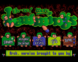
with the bubble letters saying:
Lix
A Game Inspired By
Lemmings
Would be nice to have, i tried but cant get the lettering looking nice enough in a similar style.
Hope someone can help Thx
Rub
Basically it would look something like this from ONML
with the bubble letters saying:
Lix
A Game Inspired By
Lemmings
Would be nice to have, i tried but cant get the lettering looking nice enough in a similar style.
Hope someone can help
ThxRub
Title: Re: New title screen picture
Post by: NaOH on July 06, 2014, 03:06:28 AM
Post by: NaOH on July 06, 2014, 03:06:28 AM
Quote
Wondering if someone is able to make NaOH's background screen into a nice desktop wallpaper.
Somehow I missed this when you posted it! Which image did you want -- the mountains or the dirt?
EDIT: here's a wallpaper-sized version of the existing image. No fancy text, though.
Title: Re: New title screen picture
Post by: RubiX on July 07, 2014, 02:38:05 PM
Post by: RubiX on July 07, 2014, 02:38:05 PM
Yea that's what I want for my desktop.
If we can get it with LIX lettering it will be a stellar wallpaper for my PCs
If we can get it with LIX lettering it will be a stellar wallpaper for my PCs
Title: Re: New title screen picture
Post by: NaOH on July 09, 2014, 05:26:49 AM
Post by: NaOH on July 09, 2014, 05:26:49 AM
This is getting there.
Title: Re: New title screen picture
Post by: RubiX on July 09, 2014, 09:28:28 AM
Post by: RubiX on July 09, 2014, 09:28:28 AM
Yep. I like
If u could make one with horizontal letters also it would be a nice choice. But its fine vertical too
If u could make one with horizontal letters also it would be a nice choice. But its fine vertical too
Title: Re: New title screen picture
Post by: NaOH on April 19, 2015, 09:04:22 PM
Post by: NaOH on April 19, 2015, 09:04:22 PM
From IRC (http://www.nordicbots.com/?id=73&net=quakenet&cid=81576&year=2015&month=4&day=19):
<SimonN> new picture of D/A5 Lix upcoming
<SimonN> http://asdfasdf.ethz.ch/~simon/etc/lix-with-d-2015-04-18.png
<SimonN> I gotta ask NaOH whether she's got hi-res versions of her menu background image :D
Attached, for anybody interested, is a zip containing:
Temporarily in my dropbox is a zip (https://dl.dropboxusercontent.com/u/102224341/lixbg.zip) containing:
- the high-res version of the background picture
- the low-res version of the background picture
- the source .xcf file
- and a variety of 1920x1425 wallpapers that you can resize as you see fit.
All the images are unsigned (except for lixbg_highres_signed.png), and you're welcome to modify the xcf however you like. (In particular, it should be easy to drag the lettering around to wherever you like, if you know how to use the gimp.)
Here's the image (https://dl.dropboxusercontent.com/u/102224341/lixbg_highres.png) hosted on Dropbox for those who don't want to download a zip, for however long I choose to go before clearing out my Dropbox.
<SimonN> new picture of D/A5 Lix upcoming
<SimonN> http://asdfasdf.ethz.ch/~simon/etc/lix-with-d-2015-04-18.png
<SimonN> I gotta ask NaOH whether she's got hi-res versions of her menu background image :D
Quote from: RubiX on July 09, 2014, 09:28:28 AM
Yep. I like
If u could make one with horizontal letters also it would be a nice choice. But its fine vertical too :thumbsup:
Temporarily in my dropbox is a zip (https://dl.dropboxusercontent.com/u/102224341/lixbg.zip) containing:
- the high-res version of the background picture
- the low-res version of the background picture
- the source .xcf file
- and a variety of 1920x1425 wallpapers that you can resize as you see fit.
All the images are unsigned (except for lixbg_highres_signed.png), and you're welcome to modify the xcf however you like. (In particular, it should be easy to drag the lettering around to wherever you like, if you know how to use the gimp.)
Here's the image (https://dl.dropboxusercontent.com/u/102224341/lixbg_highres.png) hosted on Dropbox for those who don't want to download a zip, for however long I choose to go before clearing out my Dropbox.
Title: Re: New title screen picture
Post by: Simon on April 19, 2015, 10:04:54 PM
Post by: Simon on April 19, 2015, 10:04:54 PM
Right on, this is a lovely scenic image.
Explanation of what's cooking for non-IRC-followers:
I would like to support arbitrary desktop resolutions. The user interface scales already well in the screenshot. Icons/bitmaps need to be available in several different scalings, so the best one can be selected at runtime. The background image can be cropped and scaled from a large source image, and this is it. Scaling up from the C++/A4 640x480 version would look odd against the smooth menu.
The gameplay will not be affected by the GUI scaling. Instead, a higher resolution makes more of the level visible at once. The zoom levels can become a user option. Some people have expressed a desire to zoom out in the 640x480 version; this will be achieved on a contemporary resolution by the 1x zoom.
-- Simon
Title: Re: New title screen picture
Post by: RubiX on April 20, 2015, 04:04:10 AM
Post by: RubiX on April 20, 2015, 04:04:10 AM
Nice ^